Friday, July 29, 2016

Persimmon Rustic Boho Vintage Cabinet Makeover ~ A MUST SEE!

I don't do "warm" colors often enough.  I'm always more drawn to painting turquoise colors than I am corals. Are you the same way? Do you have a favorite color or group of colors you lean towards when decorating? I don't wear orange or yellow, of any shade, but I adore them paired with turquoise, teal and blue...must be that color wheel thing again. 


Here I used Persimmon from General Finishes and highlighted a few areas with Somerset Gold and Patina Green. My goal was to make this gorgeous paper look like vintage wallpaper. My sister in law says it looks painted but I think she is biased, a little. 


Between the warmth, the texture, the shape and the metal detail on top of this mini cabinet, I love how this makeover turned out.  I'm happy to know someone else loved it, also.  It sold within a few minutes of posting. Yea!


Well, I'm looking forward to the weekend!  I hope you all have a great one.  I'll be adding two new pieces to my shop next week so stick around!

~~Dionne

Wednesday, July 27, 2016

Rustic Boho Console Table Hand Painted in a Palette of Coastal Waters

Oh my goodness! 

Raise your hand if you love this blue!?!?


If you don't have your hand raised, I get it. This color is bold.  It's risky, especially for those of us that are hoping to sell our painted furniture pieces. For me, this color takes me, outside, to the coast, to the deep blue water of the ocean. It's provides a memory from a past vacation or better yet, helps me looks forward to the next trip to the beach. I know it sounds like a cliche but some colors really do "speak" to me. This combination is energetic but also soothing at the same time.  


   Um, yuck. No thanks, right?


I used General Finishes paint products for this piece This blue covered so easily...only one coat for this fella. 

I used the milk paint in Klein BluePersimmon and Patina Green to create this layered look. I love this piece of furniture.  The hardware is perfect for this rustic boho look I created with the distressed painted finish.  I think it would make a great entry piece or a TV console, don't you?


I thought I'd share one of my go-to's for choosing color combinations.  The color wheel shows complimentary and analogous combinations. The color wheel provides a visual for color context and color harmony. Both of these are needed to please the eye, otherwise, we see boring or chaos...two things I prefer to avoid.


Click HERE and HERE to see the first two pieces in this series, Coastal Waters.  This piece is available on my website, www.theturquoiseiris.com. 


Now let's all get ourselves to the beach!

~~Dionne 

Thursday, July 7, 2016

Bohemian Vintage Wardrobe Hand Painted in Sante Fe Turquoise & Windsor Blue

Hello, Friends!

Anyone else spending their Summer in 100 degree weather? It's so hot and humid here in Oklahoma City.  I have to almost push myself out to the garage to paint during the months of July & August.

BA-RU-TAL.

I did, however, create a weathered multi colored finish on this vintage wardrobe.  Plus, my hats made their staging debut.


This makes #2 in my newest Summer series, 
Coastal Waters


I used all products from the CeCe Caldwell Paints line. The colors I chose are Sante Fe Turquoise, otherwise know as the prettiest turquoise EVER. I also used Windsor Blue and a tiny bit of Pueblo Pepper.  For some reason, using just one color at a time seems disappointing, so for now I'm playing with textures and blending.


In case you're wondering, wardrobes are so much harder to paint than dressers, buffets or chests. There's a whole lot more surface area but also the large flat surfaces are hard to get a good texture on. If you're a painter, you know the pieces with detail are easier to achieve a worn and distressed look.


That red you see is Pueblo Pepper, also by CeCe Caldwell Paints. 
Here is a "before" image.  This piece sat in a store for weeks and weeks.  It just needed a new look. 


Look at that huge copper pot I found last week.  I'm storing this on our driftwood bookcase and filling it with Mexican style blankets.  


I love the imperfection here.  The chippy texture reminds me that beauty is in the eye of the beholder. Plus, any chance I can make a mess and get away with it is a good thing for me!

This piece has just sold and will be headed to a new home next week!

If you haven't seen my post on the first piece in this series, click HERE to read.


Hope you all are having a fun Summer!

~~Dionne

Saturday, July 2, 2016

New Series Begins Today!! Introducing... Coastal Waters

I have no doubt that I'll be doing a Part IV - Doors series in my future. 
However, it's now time for my Summer Series titled, Coastal Waters.


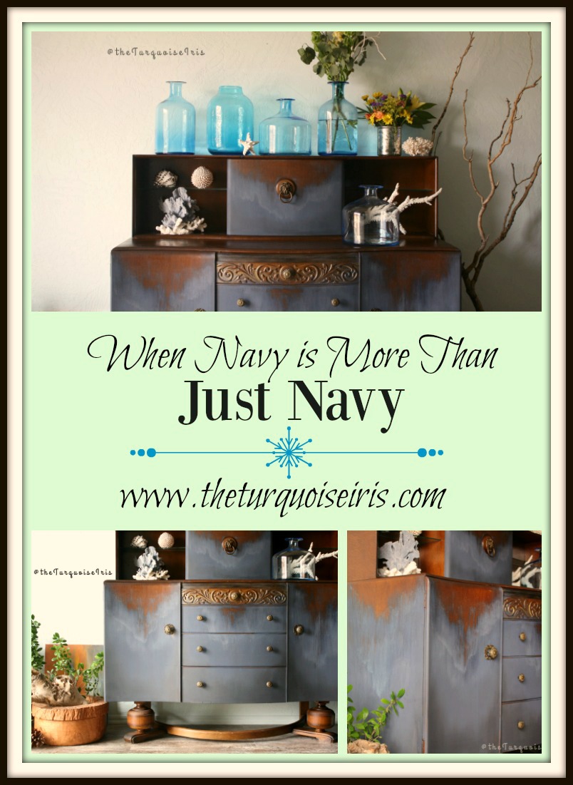
This will include shades of blue...my favorite!!! I began with the darkest shade of blue, 


Do you see the way the paint has a sort of "saltwater" finish? I didn't know it would do that!!! Seriously, the paint took on a life of it's own.  I just followed it's lead.  I used all products from CeCe Caldwell Paints including the gold wax.  Look closely, there is just a little in the center top drawer.  I wanted to highlight the carvings. 


I've already received so many kind comments and encouraging words about this makeover! 

I held on to this piece for a couple of months before I painted it.  My husband actually told me he'd buy it for me so I wouldn't paint it.  So, I listed it on my shop and waited, waited and waited.  I had a little interest but no offers to purchase.  I paid quite a bit for it, knowing this piece could be even more amazing.  


Enter CeCe Caldwell. She wanted me to try her paint and let her know what I thought about it. Guys and gals, this paint is a dream! What impressed me the most was the way the paint covered and made this saltwater finish.  It actually helped me turn my "vision" in to a reality.  I pictured a wave rushing up to the sand.  Have you ever noticed how the saltwater leaves a white, wavy bubbly line? Right before it vanishes, another wave comes rushing up, right?

The gold highlights I created with the wax are my idea of the sun glistening on the water. That original hardware is just so special.  


I'd love to see this piece being used as a dining room buffet, a wine bar or even a coffee bar. It's exquisite in design and I really love the new look.

This is the first piece in this series.  I'm off to start the second piece!

Happy holiday weekend to you all!

Interested in seeing a few other makeovers? You may like This OneThis One, or even This One.

Lastly, the winner of my Giveaway is Shannon Long!! She will now have the opportunity to visit with me one on one about staging or prop questions or anything, really! Thanks to all who signed up.  I'll be having another giveaway soon.

~Dionne